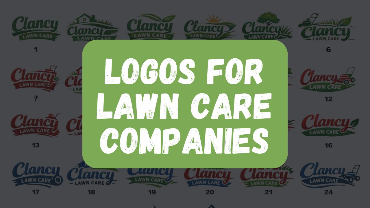
If you run a lawn care business, your logo isn’t just a decorative element — it’s one of your most powerful marketing tools. It’s what people see on your truck at a stoplight, on a trailer driving through the neighborhood, on a yard sign after a job well done, or on a flyer tucked into a mailbox. In many cases, your logo is the very first impression someone has of your company.
The good news? You don’t need to spend thousands of dollars to create something effective.
There’s a common misconception that professional logos must cost $5,000 or more to be taken seriously. While high-end branding agencies do exist (and they can do excellent work), a strong lawn care logo is less about price and more about strategy. Understanding the proven elements that make a logo memorable, readable, and visually appealing will take you much further than simply throwing money at the problem.
“Logos for lawn care companies are important because you need to be aware of certain proven and tested elements — like what colors actually convert and draw the eye.”
Let’s explore what actually makes a great lawn care logo, when expensive design might make sense, and how you can get a professional look without overspending.
The Science of Colors and Visibility
Color plays a huge role in how people perceive your brand — and more importantly, whether they notice it at all.
In the lawn care industry, certain colors perform better because they align with customer expectations and natural associations. Greens, yellows, and blues are common because they represent grass, sunshine, and trust. But simply choosing green isn’t enough. Contrast is what makes a logo visible from a distance.
For example:
- A bright lime green on white might look great on a website but disappear on a truck.
- Dark green paired with yellow or white often pops better outdoors.
- High contrast combinations improve readability at speed.
Think about your logo in real-world scenarios:
- Driving 45 mph past your truck
- Glancing at your trailer at a red light
- Seeing your yard sign from across the street
If someone can’t read your business name in two seconds or less, the logo isn’t doing its job.
Simplicity Wins at a Glance
One of the biggest mistakes lawn care companies make is overcomplicating their logos. Too many icons, gradients, fonts, or details create visual clutter. The result? People remember nothing.
Your goal is instant recognition.
“At a drive-by, at a glance… you don’t want it so busy that people think, ‘Wait, what was that? I didn’t even get the name.’”
The most effective service logos usually follow a few principles:
- Clear business name — readable from distance
- Simple icon or symbol — not required, but helpful
- Limited colors — typically 2–3 maximum
- Bold typography — easy to read on vehicles and signs
Remember: your logo isn’t fine art. It’s a marketing tool.
Do You Need an Expensive Logo Design Agency?
There are branding firms that charge $5,000, $10,000, or even $50,000+ for logo development. These firms often provide deep brand strategy, research, messaging frameworks, and full identity systems. That level of investment can make sense for large companies, franchises, or businesses planning national expansion.
Examples of premium branding firms include:
- Infantree — based in Lancaster
👉 https://infantree.com - Pentagram
👉 https://www.pentagram.com - Landor & Fitch
👉 https://landor.com
These agencies can absolutely create beautiful work. But for a local lawn care company operating within one region, that level of investment is usually unnecessary.
“Logos for lawn care services don’t need to cost $5,000… but they are important.”
Most small service businesses benefit more from investing money into:
- Equipment upgrades
- Marketing campaigns
- Website and SEO
- Truck wraps
- Hiring employees
A great logo should support growth — not drain your startup budget.
Affordable Online Logo Builders: Pros and Cons
Technology has made logo creation more accessible than ever. There are many online platforms that allow you to generate logos quickly and affordably.
Some popular options include:
- Looka
👉 https://looka.com - Fiverr
👉 https://fiverr.com - Canva
👉 https://canva.com
These tools can be useful, especially when you’re just starting out. However, they come with tradeoffs.
Advantages
- Very affordable
- Fast turnaround
- Easy to experiment with ideas
- Good for temporary branding
Limitations
- Generic designs used by many companies
- Limited understanding of your industry
- No strategic testing for real-world visibility
- May not include proper print files or color systems
The biggest drawback is industry expertise. A designer who understands lawn care marketing knows how logos will appear on trucks, uniforms, trailers, and signage — not just on a screen.
A Practical Middle-Ground Approach
One smart approach is using pre-designed, professionally developed logos created specifically for lawn care businesses — then customizing them with your company name.
For example, companies like Lawn Care Launchers offer packaged logos designed by in-house U.S.-based designers who understand the lawn care industry. These logos are built using proven color combinations, readability standards, and branding principles that work in real-world conditions.
The concept is simple:
- Designers create a unique logo concept
- You purchase the rights to that design
- It’s customized with your business name
- You receive all the files and color palette
- No long revision process required
When you buy one, it’s yours — and no one else gets it.
This approach eliminates guesswork while staying affordable.
Designing for Real-World Marketing (Not Just Screens)
A common mistake business owners make is approving a logo that looks great digitally but fails in physical environments.
Your logo must work across:
- Truck wraps
- Trailer decals
- Yard signs
- Business cards
- T-shirts
- Social media
- Websites
- Invoices and documents
Each environment has different lighting, distance, and material constraints. A professional lawn care logo considers all of them from the start.
For instance:
- Thin fonts disappear on vehicles
- Gradients don’t print well on vinyl
- Complex details get lost at small sizes
- Low contrast fades in sunlight
This is why industry knowledge matters more than artistic flair.
Ownership, Files, and Brand Consistency
Another critical factor is ownership and usability.
When you get a logo, you should receive:
- Vector files (AI, EPS, SVG)
- High-resolution PNG and JPG
- Black and white versions
- Color codes (HEX, CMYK, RGB)
- Font information
- Usage guidelines
These assets ensure you can reproduce your logo consistently across all marketing materials.
Consistency builds recognition — and recognition builds trust.
When It Might Make Sense to Spend More
There are situations where investing heavily in branding is reasonable:
- You’re launching a franchise
- You plan multi-state expansion
- You’re building a premium luxury brand
- You need full brand strategy and messaging
- You’re rebranding an established large company
For most local lawn care companies, however, the return on investment simply isn’t there compared to spending on customer acquisition.
The Bottom Line: Strategy Beats Price
Your logo is important — but expensive doesn’t automatically mean better.
What truly matters is:
- Visibility from a distance
- Simplicity and readability
- Strong color contrast
- Industry relevance
- Consistency across marketing
- Professional file delivery
- Clear ownership rights
A well-designed logo can absolutely help your business grow. It builds credibility, makes your company memorable, and turns your vehicles into mobile billboards.
But you don’t need to spend thousands to achieve that.
“What you’re delivering is a proven, ready-to-go logo that you can confidently print and put on trucks, brochures, and business cards.”
If you focus on proven design principles and practical marketing use, you’ll end up with a logo that works — and that’s what really matters.